by Dr. Jeff Carter and Pat Carter
For more on this topic, go to www.dentaleconomics.com and search using the following key words: Mint Hill Dentistry, design, Matsco, Dr. Earle Sullivan, Dr. Jeff Carter, Pat Carter.
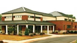
Congratulations to the winner of the 2009 Dental Office Design Competition for group practices, Mint Hill Dentistry in Mint Hill, North Carolina. This annual competition is sponsored by Matsco, Dental Economics®, and ADA Member AdvantageSM. The DE cover photo is of the Mint Hill waiting area.
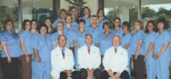
With a practice philosophy of exceptional care for every patient who walks through the door, there was no longer any updating to the office that could fulfill the needs of the practice at Mint Hill Dentistry in Mint Hill, N.C. The committed staff of 19 was keenly aware of the limits of the 4,500 sq. ft. building, which was conceived 30 years earlier on a paper napkin by Dr. Earle Sullivan. As happens with many practices, the office that had worked well through the years had now become a hindrance.
The shortcomings of the 30-year practice home were highlighted during practice every day. They were desperate for more storage, more operatories, more waiting area space, more parking, and more patience with each other, especially on extra busy days. The thought of refurbishing an office that had no chance of serving their needs functionally did not make sense.
Any effort made to bring new technology into the practice only added to the chaos. The unfortunate reality was that further growth of the practice was not possible within the confines of their beloved office.
It was no longer a question of whether something needed to change, but rather how best to make the change. Their goal was clear — build an office that worked for them, instead of them working around the building. They knew they needed help, so they researched and assembled a team of the right people that could best achieve the office they envisioned.
The right people were those that listened, asked the right questions, and became as committed to their vision as they were. The time spent selecting these professionals was key to their successful project outcome, including their financial advisors, lender, design team, equipment supplier, IT installer, and contractor — who all had experience in the details required to deliver a quality-driven project.
With their professional team in place, they evaluated their site options. This proved challenging, with offers made on properties that were denied or countered, design dictates by the city, and more. It was challenging because they were anxious to move forward, yet determined to secure the right property. It took time, but once accomplished they immediately started with our design team at Practice Design Group (PDG) to develop an office based on the specific way they practice and the experience they want to create for their patients.
The design
This focus included gaining information from the Mint Hill Dentistry team. From the beginning, we asked each team member for both a needs and a wish list, with the expressed goal to address the needs and work toward the wishes. We knew all team members were going to use the new building and could offer unique perspectives.
In fact, we found their input invaluable to accomplishing primary design goals — improved efficiency and effective ergonomics. We learned a lot from each other, with all feedback considered and influencing the design throughout the entire project’s development, including plan reviews, cabinetry design, equipment/technology selection, and more.
First priority was function
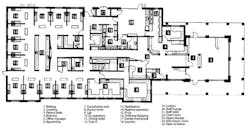
We understood firsthand the stress created by an office with three dentists, clinical and administrative staff, too little square footage, and outdated spaces. Optimum function for the new building meant both an efficient use of square footage, and an effective layout of spaces that promoted easy flow and access for staff and patients throughout.
When plans were received from PDG, they had each department (doctors, hygienists, assistants, front office) review and offer input. Not too surprising, things agreeable to the doctors would be flagged as problematic for a team “user” or visa versa.
Viable feedback was delivered back to the design team until the layout addressed all the objectives, including all operatories designed the same so that each staff member could work seamlessly from operatory to operatory, a centrally located sterilization area that was equally accessible to all 12 operatories, centrally located and segregated supply areas for hygiene and doctors, clearance in main access and operative corridors for staff and patients to pass easily, and sufficient space at the reappointing area for multiple patients to exit, meaning no more bottlenecks.
Some benefits of the layout weren’t fully appreciated until they began working in the new office, such as the separation of the clinical activities from the front desk area. The stress patients and staff experienced daily in the old office with overlapping treatment and front desk activities is now gone.
Once the overall layout was defined, each space was developed in detail by the design and Mint Hill team. These included prime user access, counter space, storage requirements, equipment and technology needs — down to drawer placement and size. Each space was defined by current as well as future needs, with the common goal being an office that would support the practice growth their previous office had stifled.
The dental technology
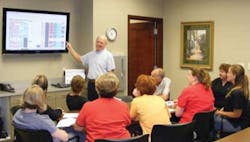
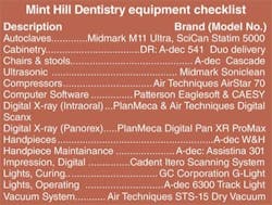
A driving force in the design was the desire to introduce the dental technology they had been unable to in their old office. Exceptional care for patients meant integrating up-to-date technology into the treatment experience, starting with paperless charts. They no longer search for an “MIA” patient chart, and intraoral photographs/radiographs can be quickly e-mailed to specialists. Each day’s schedule is reviewed on the staff area’s large screen monitor, where they collaborate on potential problems and identify any special needs of patients before treatment begins.
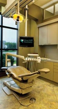
For patients, a large monitor in the consultation area delivers easy-to-see diagnostic photos, treatment plans, and educational CAESY programming. The fully networked system features operatory pendulum-mount monitors for diagnostic upright patient viewing, and entertainment viewing in the reclined position.
The photo-vu screens at the front corridor feature photos of team members, highlight patients’ accomplishments, and display smiles rebuilt in the practice rather than canned photos. In fact, patients can see their smile makeovers celebrated on the screen as they leave treatment with a simple drop and drag!
The esthetics
Patients connect the esthetics of a dental office with the dentistry they can expect. They had lost that in their old office, so providing a quality dental environment was paramount. When the design team asked what they wanted, the answer was simply, “WOW.” There is no doubt this is achieved the minute patients enter the reception area.
Natural lighting, and the integration of natural materials with vinyl wall-covering and flooring has achieved an interior that is calming, durable, classic, and definitely unique to the practice. The effect has raised the bar for team members, who now have a sense of pride having been part of a collaborative design process.
The construction and moveAs detailed as the design was, the construction and moving process was equally detailed. They had heard horror stories from colleagues about construction and the chaos of moving. That was NOT their experience.
Reynolds & Sons Construction was committed to a quality building outcome. The design intent was followed in detail, and any problems or changes along the way were addressed without complaint or drama. The positive collaboration fostered between the design and construction team assured that all were working toward the best possible result.
When it was time to move, each department head was in charge of moving his or her area, including packing, delivery, and organizing materials in the new office. Since they had been a part of the design, every team member understood the design intent of their space, so the move, with boxes scattered everywhere, was deliberate and filled with excitement about the coming practice days.
The impact
Colleagues cautioned them that their new facility would be perceived as the “Taj Mahal,” with existing and new patients questioning fees and assuming these were higher in the new office. In fact, patients have appreciated the reinvestment back into the practice facility, into an experience in which they participate. In the Mint Hill experience, patients are turned off by cluttered, tired, and dated facilities.
The reaction of patients? The most common remark is “Wow!” which is exactly what they were after! They offer CareCredit as their patient financing, charge the same fees, and remind patients of their goal to improve the dental experience with the very best in treatment.
Patients have responded. The new patient flow has tripled since they moved into their office. In an economy that has been a strain on many dentists, they have continued to grow and hire new staff. The impact to their practice has exceeded their expectations and they are rising to the opportunities every day!
The design and construction of the building proved to be an extraordinary experience. It reinforced that to which Mint Hill Dentistry remains committed — great teams accomplish great outcomes.
Jeff Carter, DDS, and Pat Carter, IIDA, are owners of PDG – Practice Design Group. Located in Buda, Texas, PDG offers a full range of design and consulting services to dentists nationwide. For information, call (800) 511–7110 or visit www.practicedesigngroup.com.
Editor’s Note: ADA Member AdvantageSM is a service mark of the American Dental Association. ADA Member Advantage is a program brought to you byADA Business Enterprises, a wholly owned subsidiary of the American Dental Association.
