Back by popular demand, we look at the marketing efforts of our readers and tell them if they’re making the grade. In this feature, marketing expert Joy Gendusa provides a constructive critique of direct mailers, websites, social media, and other marketing efforts. Chris Salierno, DDS, also adds his perspective. Apply their advice to stretch your own marketing dollars—and grow your business! (Editor’s note: Each number corresponds to a specific suggestion in the marketing content.)
Postcard: A
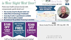
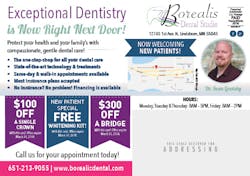
From a completely biased standpoint (Borealis Dental Studio is a client of ours), I love this postcard design. It’s bright and eye-catching while still being personable. Let’s look at this postcard for what makes it so successful and where there could be improvements.
1. Using real photos of you, your team, and/or your family is a dental-marketing must. Prospective patients need to feel like they know you and can trust you.
2. Generous offers like these make a difference. PostcardMania tracks successful dental campaigns, and free whitening is our best-performing offer. Bonus fact: 62% of those successful campaigns feature 2–3 offers. Important: I can’t tell you how many times I’ve heard dentists say that discounts “cheapen” the practice and your valuable services—but it’s been proven time and time again to work and bring in quality new patients.
3. It’s 2018, and the trust factor of testimonials has given way to more visual forms of social proof—star ratings and reviews. Be sure to include both!
4. Bullet-pointed text = Super easy to read!
5. A Google map helps recipients immediately orient themselves to your location. They’ll be thinking, “Oh, that’s close!”
6. Using a bright color that doesn’t match the rest of your design draws the eye to important information, such as your phone number and website.
Consider including the entire call to action (not just contact info) in that contrasting hot pink color to ensure everyone knows what to do next.
Chris: If your practice has invested in CAD/CAM technology, you should shout it from the rooftops!
Online banner ads: A+
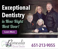
The coordinating banner ads are a perfect match for this practice’s postcard campaign. Integration like this enhances the reach and impression of both campaigns—and the overall response rate.
The consistency of this campaign is perfectly executed! This is why it pays to have a single company running all sides of your campaign. Matching online follow-up ads like these have increased response rates by 400%.1
This is a family-owned practice, so building the branding around the family is genius. Patients will be comforted when they see the same faces on their first visit!
7. This is a call tracking number that rings into the office like usual, but lets you record the call and keep track of how many people have responded directly to the ad. The postcard uses a unique tracking number as well. The practice has had 641 calls from new, unique numbers at the time of writing this.
Homepage: A
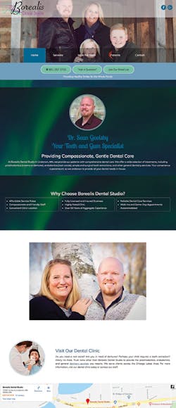
The consistency of the design continues when you visit Borealis Dental Studio’s homepage. Top marks! People landing here from postcards and online ads will immediately know they’re in the right place thanks to the consistent branding.
8. There is a lead-capture option for leads that are hot and ready to call, warm leads that might want to join the email list for a coupon or two, and then cooler leads who are shopping around and just want to offer a question. I wish that these buttons were a different color and stood out more.
9. This website’s long-scroll design makes it very mobile-friendly and responsive to different devices, which is a must in 2018.
10. Don’t make prospective patients work to know what makes you better than the competition—tell them right away on your homepage.
Facebook posts: B+
Borealis Dental Studio relies largely on organic content for its Facebook page, so it’s a good thing they’re doing it right! Most business pages have suffered since Facebook cut organic reach back in 2014.1
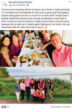
This practice posts a wide range of fun, personable content. Here is a brilliant post that demonstrates the high amount of engagement they’re still getting on organic posts.
Suggestion for improvement: Add paid ads to the Facebook lineup that coordinate with the postcard and Google ads. It’s incredibly easy with Everywhere Small Business, which creates coordinated ads on all of these platforms.
11. I love real photos of real people—creating lots of trust and affinity for the practice! Placing its new associate up front is a smart way to remind us that the practice growing and introduce the new doc.
Chris: I love that they’re showing the audience that they support local businesses. Get out of your scrubs and show everyone that your practice is an active member of the community!
Overall grade: A
With a consistent, coordinated campaign in place, new patient numbers up 143%, and a new associate on board, you can’t argue with this marketing strategy. It is #winning!
Author’s note: Want to see more? Visit postcardmania.com/borealis to watch a video featuring the owners of this family-owned practice as they talk marketing.
Reference
1. Spence E. Facebook puts everyone on notice about the death of organic reach. Forbes website. https://www.forbes.com/sites/ewanspence/2014/06/06/facebook-puts-everyone-on-notice-about-the-death-of-organic-reach/#39dc26691856. Published June 6, 2014.
