Learn what separates a winning direct mail piece from a dud
To the untrained eye, a truly well-designed dental postcard-from a marketing standpoint-is not as easy to identify as you would think. Unless you know exactly what to look for, all you're really doing is evaluating it from a personal esthetic standpoint. In other words, "Is it attractive to me?" This is not a good way to decide on the design for your practice's marketing campaign. Sometimes really beautiful designs fall flat, and sometimes really ugly designs work like gangbusters.
But it's not random. There is a reason . . .
So in the interest of helping you improve your marketing, I'd like to provide you with 10 graphic elements that must be included on your card if you want the best chance of success.
These 10 elements are based on our experience delivering campaigns for more than 66,000 clients, of whom 4,367 (and counting!) are in the dental industry. They are:
1. Clear headline
2. Supporting graphic
3. Color that pops
4. Intriguing subheadings that lead into benefits
5. Benefits! (Not just features/services)
6. Enticing offer
7. Business name and logo
8. Call to action and/or expiration date for the offer
9. Contact information-website, map, phone number
10. Return address
Here are a few dental-industry specific elements that are common among our successful dental campaign database:
• Give variety. Featuring two to three offers per postcard works best.
• Be consistent. 88.6% of our successful dental campaigns mail a minimum of three times-that's a minimum of three times. (I like to repeat myself when it's super relevant!)
• Think ahead. Our most successful dental clients order 60,000 to 72,000 postcards at a time and mail out 10,000 to 18,000 every month.
Now let's turn our attention to some real postcard designs and play a little game: good postcard or bad postcard.
Round 1:
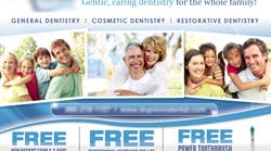
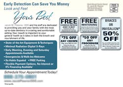
This probably comes as no surprise, but this is a good postcard. Here's why:
• They nailed all of the 10 elements above.
• They featured a real picture of the dentist and her family.
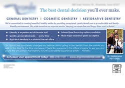
• They even included a testimonial from a real patient on the back!
I absolutely love, love, love when a dental postcard features the dentist and a testimonial. You provide a very personal service, so it's important that prospects trust you and feel comfortable making an appointment to see you.
As far as results go, this design did very well-the practice received 47 new patients off of this campaign!
Round 2:
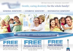
Now, I don't want to tear this postcard apart, because there are a lot of things this design does do well. It has good offers, a clear headline and subhead, and a prominent call-to-action on the back.
Having said that, here's what needs to be improved:
• The colors should be brighter and fresher, like you want your mouth to feel after you visit the dentist. Color plays an important role in how the recipient will feel about the practice. Interesting, eh?
• The features on the back should be benefits. That list of bulleted items does not really say what's in it for the patient. Believe it or not, this matters too.
• The offers on the front and back of the card should be consistent.
Overall, not a good postcard, but not terrible. Wouldn't it be interesting to know how their results improved if they fixed up those few points of contention? Then you're in luck!
We worked closely with this dental practice on their initial design and results to help them improve. Here's what their next campaign looked like . . .
Round 3:
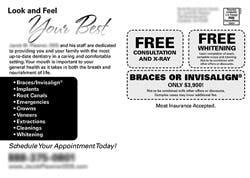
Just a few changes later, and this postcard is a winner! Bright, crisp colors (perfect for a dental practice), clear benefits, and good offers that are consistent on the front and the back.
By making these small changes (and adding DirectMail2.0, an integrated online follow-up and call tracking service), this practice jumped from receiving 3.833 calls per 1,000 postcards mailed to 6.797 calls per 1,000 cards!
Verdict? Bad postcard turned great postcard!
Think you got it? Test your skills! If you'd like me to critique your practice's current design, I'd be more than happy to. Just email it to [email protected].
Joy Gendusa is the founder and CEO of PostcardMania. Using just postcards, a phone, and a computer, Joy built PostcardMania from a one-person startup into an industry leader serving over 65,000 clients, plus more than 4,000 dentists! Need help promoting dental implants? Call one of PostcardMania's dental marketing consultants at (866) 812-8443, email Joy at [email protected], or visit http://www.postcardmania.com/designs/dental-designs.
